AI Custom Icons Can they really compete with a Human Designer?
Can AI genuinely design a consistent, production-ready set of custom icons?
We put the leading AI tools to the test using a real client brief, the same brief our designer used to create a final approved set of twenty network infrastructure icons.
![]()
These are the final approved icons, created by a human designer. But before we show you why AI couldn’t match the quality – We tested Midjourney, Firefly, Freepik and ChatGPT against a real 20-icon brief – Here’s what happened.
Why Test AI on a Real Custom Icon Brief?
The last article we published on AI Icon Design generated more engagement than any post we’ve written this year. Clearly, softwarew product owners and design leads are curious about whether AI can reduce cost, speed up concepting, or even replace human icon designers for complex UI Icon design.
To explore this honestly, we decided to run a real-world experiment using an approved, client-supplied brief for a set of twenty network infrastructure icons. These icons form part of a much larger library, now in its fifth project generation, making it the perfect test of consistency, clarity, and style discipline.
The question: Can modern AI tools produce anything close to a shippable professional custom icons?
The Brief: A Real 20-Icon Set for a Professional Network UI
We used the exact brief provided by the client (with reference imagery, metaphors and
device examples). The icons needed to cover items such as:
- Desktop computer
- Workstation
- Apple Mac
- Routers (small and large)
- Firewall
- IP Phone
- Cloud & cloud group
- Stack / network server
- UPS & network appliances
![]()
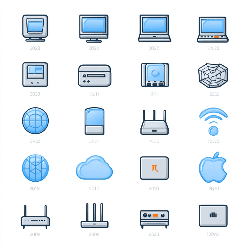
This image was part of the design brief, showing the different Icon Styles developed for the same client over the years, that all still form part of their custom icon libraries.
In other words, simple metaphors, but with strict visual consistency, platform-appropriate geometry, and smallest-size clarity.
Then we ran the same brief through four AI tools:
- Midjourney
- Adobe Firefly (ChatGPT & Flux)
- Freepik’s AI Icon Tool
- ChatGPT (the only tool able to ingest the full Word doc)
AI Results: Interesting Styles, But Not a Single Usable Icon Set
Below are the AI outputs generated from the unedited brief. All tools created something, but each failed in predictable, and surprisingly consistent, ways.
1. Midjourney
Extremely simple rendering, poor quality, and completely unusable. Midjourney appears entirely unsuitable for creating icon sets. Metaphors blur into one another, styles clash, labels are inconsistent, and many icons are unrelated to the brief.
- no real adherance to the design brief
- inconsistent silhouettes, palette and line weights
- fictional devices or metaphors
- zero ability to keep a unified system
- very poor rendering quality
It simply isn’t designed for production iconography, great for moodboards, not for UI assets.
2. Adobe Firefly (ChatGPT & Flux engines)
Firefly produced visually polished icons with the ChatGPT engine, but the issues were undeniable and even less consistent with FLux:

- labels were wrong, misspelled, or missing
- metaphors drifted (e.g., cloud ≠ cloud group)
- style varied unpredictably with Flux
- some icons merged multiple devices into one
Certainly the closest of the AI tools visually when using ChatGPT, but still not systematic, not consistent, and not production-ready, most especially with Flux which like, but not as bad as, Midjourney seems unsuitible for Icon Sets.
3. Freepik AI
We expected good results because Freepik has its own icon libraries and is part of Iconfinder. Instead, we got:


- isometric Icons, not part of the design brief
- inconsistent, muddled and merged metaphor choices
- refusal to include text labels
- random unrecognisable metaphors
4. ChatGPT
The only tool capable of reading the entire Word document brief, the other engines needed seperate truncated text briefs and seperate images uploaded, so ChatGPT was much more convenient.
It asked clarification questions and attempted a more structured approach. The visual results are very similar to Firefly using the ChatGPT engone, as you would expect but the results were an improvement, with better but still has imperfect labelling and it also failed to render all 20 icons in the brief.
The output still suffered from:

- did not render all 20 icons in the brief
- some metaphors were incorrect or unrelated
- no SVG export supported
- some labels were incorrect or incoherent
This was definitely the best attempt of the AI tools we tried and whilst the results were fast and the metaphors were motsly accurate, the style itself was not particularly refined or professional looking. Certainly not something you would expect in a premium product.
None of the AI tools produced anything close to a professional usable icon set. The best they offered was style exploration, not production assets.
The Human-Designed Icon Set
Now compare those results with the final, approved icons created by our lead designer, Tanya. These twenty icons were accepted without a single requested edit, not surprising, as this is the client’s fifth project with us and there is no substitute for learning the taste of your client over time. Yes these icons took a lot longer to produce than the AI icon tools we used but the result is a coherent, original and professional looking set the client was immediately happy with.
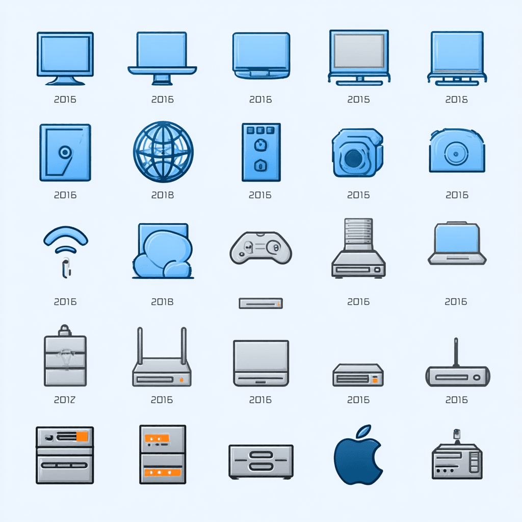
![]()
The final 20 human-designed icons. Zero edits requested.
Why These Work (and AI’s Don’t)
- Consistent style, palette and geometry: stroke weights, corner radii and silhouette logic match perfectly.
- Accurate metaphors: routers look like routers, WAPs look like WAPs, no invented devices or design drift.
- Platform-aware: created to scale cleanly and export to SVG or PNG as required.
- Visually cohesive: one system, one voice — not an accidental mix of aesthetics.
- Delivered via Icon Manager: all icons viewed and reviewd by the client in our bespoke project management system.
These icons are also part of a much larger, long-term library, meaning style continuity and design memory matter. AI has no concept of either.
Where Human Designers Shine: Variants & Versioning
For several icons in this project, our designer produced micro-variants, subtle refinements to negative space, silhouette weighting or metaphor emphasis. This kind of controlled, experience-led variation is something AI tools cannot do.
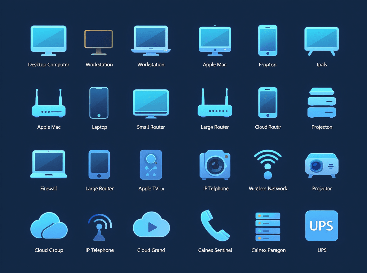
![]()
One thing AI will never manage is delivering your icons via Icon Manager, the simpest and fastest ‘view and review’ icon management system by Creative Freedom
Using our Icon Manager platform, the client could compare options side-by-side, leave feedback, and download exports in the exact sizes required for their Windows and web applications.
So What Is AI Actually Good For?
This experiment reinforces our general stance:
AI is useful for ideas, not for systems.
- early visual exploration
- moodboard generation
- style tone discussion with stakeholders
- testing metaphor directions
But when a design system needs:
- consistency
- accuracy
- clarity at small sizes
- predictable geometry
- multi-size deliverables
- client-specific preferences
AI simply isn’t ready.
Conclusion: AI Helps, But Human Designers Still Lead
The AI tools we tested produced interesting styles but failed to deliver:
- a coherent system
- accurate metaphors
- consistent geometry
- professional export formats
Human designers still outperform AI in every area that matters for custom icons used in real software.
AI can accelerate imagination, but it cannot yet replace the judgement, precision and consistency required for production UI icon design.
