SVG Icons for UI Designers: Myths, Best Practices, and What Really Works
The Truth About One-Size-Fits-All and Other Myths
What You’ll Learn in This Guide
Jump to the section that interests you most:
- Why Software UI Icons Require More Thought Than Web Icons
- The One-Size-Fits-All Myth
- Developing a Comprehensive Style Guide
- SVG Export Best Practices for Software UI Icons
- Efficient icon project management with Icon Manager
- Need Expert UI Icon Designers for Your Software?
SVG icons are often praised as the ultimate scalable graphics solution for UI design. But do they truly work for every scenario? While it’s true that SVGs offer exceptional flexibility—particularly on high-resolution 4K+ displays—there are caveats. Designing SVG icons for UI designers and software applications isn’t always as simple as it seems. In this article, I’ll debunk common myths and share best practices for crafting UI icons that look sharp and consistent, whether for apps, websites, or desktop software.
Why Software UI Icons Require More Thought Than Web Icons
Designing icons for software UI is a different beast compared to web icons. Unlike web environments where SVGs generally work seamlessly, software development platforms vary widely in their support for image formats. Many legacy applications still rely on PNG, ICO, or BMP formats, while modern software increasingly supports SVG. But even then, compatibility issues arise depending on how the SVG is formatted.
After all, an SVG is just an XML text file describing vector graphics. Depending on how that code is structured, it may not display correctly in every environment. As software icon designers, it’s our job to navigate these technical constraints to deliver icons that work flawlessly every time.
The One-Size-Fits-All Myth
The Myth: “SVGs can scale to any size, so you only need one file. Just resize it and you’re good to go!”
At Creative Freedom, we always create pixel-perfect icons at the exact dimensions they’ll be used. This is even more critical in software icon design than in web or mobile apps. Here’s why:
Excessive Scaling Kills Consistency
Icons often need to appear at multiple sizes. Menu icons might be 24×24 or 32×32 pixels, while dropdowns or explorer-style menus use 16×16 pixels. While SVGs technically can scale, this often leads to visual inconsistencies. Line weights don’t scale uniformly, and smaller sizes can become blurry due to anti-aliasing, particularly on standard monitors.
Consider the example below, where we designed a single CAD software icon for AVEVA. The first row shows icons drawn pixel-perfect at 32×32 and 24×24 pixels. The second and third rows show scaled-down and scaled-up versions, which look subtly, but noticeably, off. These inconsistencies become even more pronounced across large icon sets.
![]()
In the example below the first two columns show how the paste and cut icons look when a separate icon is drawn for each size, using the same line weight. The 3rd column shows the same icon drawn in the smaller size and scaled up. The line weight also doubles and the scaled icons look fat and out of place next to the other sizes.
![]()
For software UI, best practice is always to create individual pixel-perfect icons for each required size. There are rare exceptions, but for the limited extra effort involved, it’s worth ensuring clarity and consistency.
Developing a Comprehensive Style Guide
Consistency at Scale: Why an Icon Style Guide is Essential
Creating icons for large-scale software projects, especially complex systems like CAD, CRM, or analytics platforms—requires maintaining consistency across thousands of icons. When multiple UI icon designers are involved, a clear style guide prevents inconsistencies and excessive rework.
A solid style guide typically includes:
- Color Palette – Standardized colors to maintain uniformity
- Line Weights – Ensuring consistent stroke thickness at various sizes
- Padding & Margins – Defining spacing rules for UI placement
- Angles & Glyphs – Keeping icon shapes visually harmonious
- Pixel Grid Alignment – Avoiding blurry icons due to improper alignment
- Style Examples – Icons approved in the style development stage for guidance
Below is an example of a detailed icon style guide from a large project requiring thousands of icons:
![]()
A well-defined style guide minimizes rework and ensures a polished final product, no matter how large the project.
SVG Export Best Practices for Software UI Icons
Often, clients aren’t aware that there are different ways to create and export SVGs. We start with a generic format that works in most cases, then fine-tune based on the software’s requirements. Here are two common export approaches:
Exporting SVGs for Maximum Compatibility
Steps in Adobe Illustrator:
- Keep artwork on two primary layers:
border(bounding box for placement)icon_design(graphical elements)
- Use “Export for Screens” (Ctrl + Alt + E)
- Format: SVG
- Styling: Presentation Attributes
- Object IDs: Layer Names
![]()
![]()
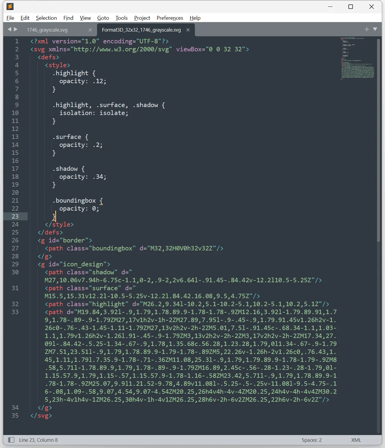
Exporting SVGs for CSS Control
For software environments that need CSS-based styling, this method embeds styles directly into the SVG.
This allows UI developers to control icon colors dynamically, perfect for light/dark themes and hover effects.
Steps in Adobe Illustrator:
- Assign styles using the Appearance Panel
- Save styles in the Graphic Style Panel (e.g.,
.surface,.shadow,.highlight - Drag styles onto the relevant
<Compound_Path>elements - Use “Export for Screens”
- Format: SVG
- Styling: Internal CSS
- Object IDs: Layer Names
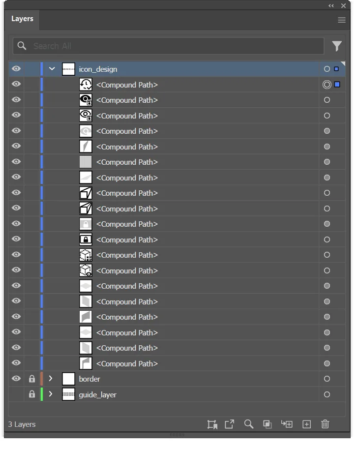
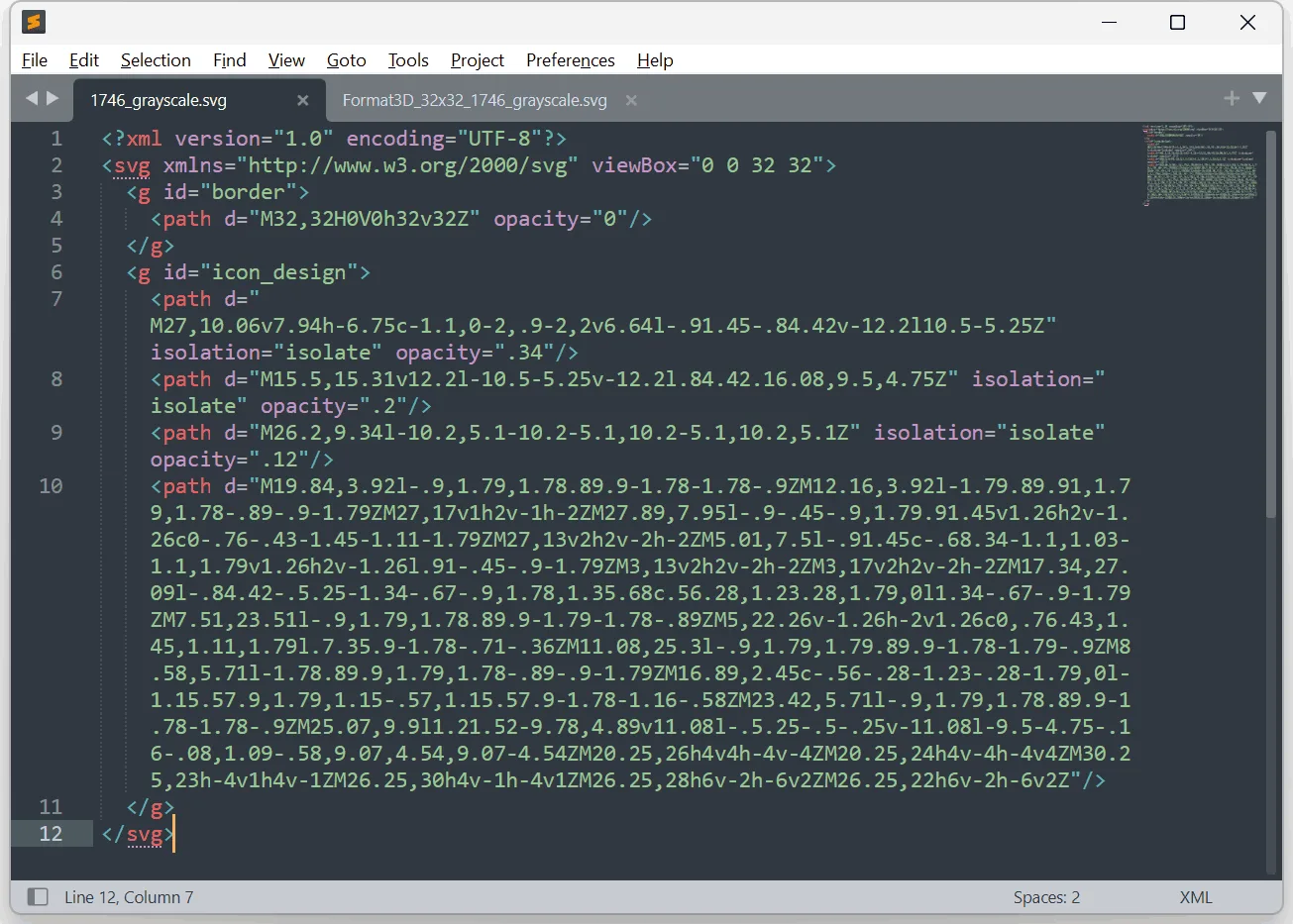
<compound_path> elements in the layers panel![]()
Icon Project Management: Why Icon Manager Is a Game Changer
Streamlining Icon Projects with Icon Manager
Managing a large-scale software icon design project can quickly become overwhelming, especially when dealing with multiple versions and approvals. Enter Icon Manager, our proprietary tool that simplifies icon project management for both our team and clients.
Icon Manager benefits
- View your project and collaborate in real-time
- Receive instant notifications for new uploads, edits, or questions
- Approve, reject, or provide feedback seamlessly
- Track project progress with detailed stats
- Eliminate messy email chains and lost files
For large-scale CAD software icons and UI icon design projects, Icon Manager slashes project lead times and keeps everything transparent and organized.
Need Expert UI Icon Designers for Your Software?
If you’re looking for pixel-perfect, professionally managed SVG icons for UI designers, let’s talk.
Working with creative freedom was fun and effective, made better by possibly the most efficient project management system I have yet to work with – Icon Manager. The project was delivered on time in full and the creative freedom team were very flexible in accommodating any changes
Andrew Holm

